LinkedIn Banner: Size, Ideas and Examples That Convert
The right size, the layout that works and 7 banner ideas that turn profile visitors into followers and clients.

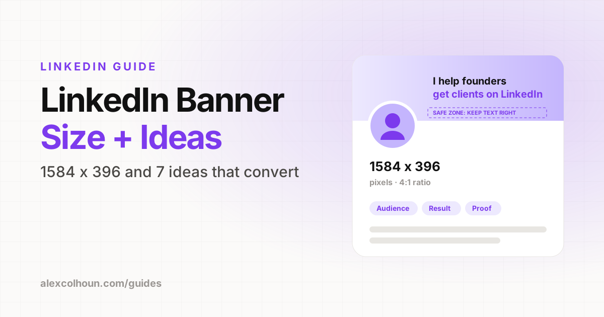
The LinkedIn banner size is 1584 x 396 pixels (a 4:1 ratio). The best banners do one job: tell a visitor in about three seconds who you help, what you help them do and where to go next. Keep the important text on the right side, because your profile photo covers the bottom left, and check how it looks on mobile before you publish.
Your banner is the biggest piece of real estate on your LinkedIn profile, and most people leave it as a stock photo of a city skyline or the default blue background. That is a missed opportunity. Every visitor who lands on your profile from a post sees it before anything else.
Here is how to size it, what to put on it, banner ideas you can copy and the mistakes that make good banners look bad.
LinkedIn banner size and specs
| Spec | Recommendation |
|---|---|
| Dimensions | 1584 x 396 pixels |
| Aspect ratio | 4:1 |
| File type | PNG or JPG |
| File size | Under 8MB |
| Safe zone | Keep text away from the bottom left (photo) and the edges (cropped on mobile) |
Design at exactly 1584 x 396. If you upload a different size, LinkedIn will crop it, and the crop rarely lands where you want it to.
What your banner should do
A banner is not decoration. It is the headline of your profile page. A visitor should be able to answer three questions from it at a glance:
- Who is this for? Name your audience.
- What do they get? State the result or topic.
- Why believe it? Add one proof point: a number, logos or a recognizable credential.
Optionally, add a fourth element: a next step, such as "Free guide in Featured" or "Newsletter below".
The layout that works
- Right side: your main message. This is the area least likely to be covered or cropped.
- Left side: leave space. Your profile photo sits over the bottom left on desktop and in a different spot on mobile.
- One message: one main line of text, one supporting line, one proof element. That is it.
- High contrast: dark text on a light background or the reverse. Low contrast becomes unreadable on a phone.
- Brand colors: use the same colors as your carousels and website so everything looks like you.
LinkedIn banner ideas you can copy
1. The value proposition
"I help [audience] [get result]" in large text, with a short supporting line. The simplest option and usually the most effective for service providers.
2. Value proposition + proof
Your main line plus one number: followers, clients helped, revenue generated or years of experience. Only use numbers that are true and that you are happy to be asked about.
3. The logo bar
"Trusted by" or "Featured in" with three to five recognizable logos. Works well if you have worked with brands your buyers know.
4. The content promise
"Daily posts on [topic] for [audience]." Ideal if your main goal is followers, because it tells people exactly what they get by following.
5. The lead magnet pointer
Your main line plus "Get the free [resource] in my Featured section ↓". Turns the banner into a signpost for your best lead magnet.
6. The newsletter or community
"Join [number] founders reading [newsletter name]." Useful if your newsletter or community is your main conversion path.
7. The company banner
For founders who want to drive attention to their company: product screenshot, one line on what it does and who it is for.
How to make a LinkedIn banner
- Open Canva (or Figma) and create a custom design at 1584 x 396 pixels.
- Set your background: a solid brand color, a subtle gradient or a simple texture.
- Add your main line on the right half in large, bold type.
- Add one supporting line and one proof element.
- Leave the bottom left clear for your profile photo.
- Export as PNG and upload it from your profile by clicking the camera icon on the banner.
- Check it on your phone. If any text is cut off, move it toward the center and re-upload.
Make it match the rest of your profile
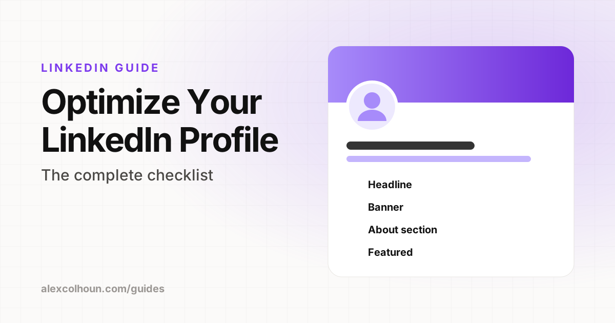
The banner, headline and About section should all say the same thing in slightly different words. If your banner says "LinkedIn growth for founders" and your headline says "Marketing consultant", visitors get confused and leave. Use the LinkedIn headline examples and the About section examples to line everything up, then run the full profile optimization checklist.
Banner mistakes to avoid
- Stock photos of skylines, laptops or handshakes that say nothing about you.
- Too much text. If it takes longer than three seconds to read, it is too much.
- Text under the profile photo. Always check the bottom left.
- Tiny fonts that are unreadable on mobile, where most people view profiles.
- Outdated information, such as an old offer, old follower count or an event that already happened.
- Mismatched message with your headline and Featured section.
How often to update your banner
Update it whenever your offer, audience or best proof changes. Some creators also swap in a temporary banner to promote a launch, a live event or a cohort, then switch back. Just remember to switch back.
Want feedback on your banner and profile? Post it inside The Growth Innovator community on Skool. Profile reviews are free.
Frequently Asked Questions
What size is a LinkedIn banner?
A LinkedIn personal profile banner is 1584 x 396 pixels, a 4:1 ratio, uploaded as a PNG or JPG under 8MB.
What should I put on my LinkedIn banner?
Who you help, the result you get them and one proof point, plus an optional next step such as pointing to your Featured section.
Where should text go on a LinkedIn banner?
Keep important text on the right side. Your profile photo covers the bottom left and the edges can be cropped on mobile.
What is the best tool to make a LinkedIn banner?
Canva is the easiest. Create a custom design at 1584 x 396 pixels and export it as a PNG.